TLDR: By default, css adds padding and margin values to the width and height of your elements. A 200px wide box with 10px padding will have an effective width of 220px. Use
box-sizing: border-box;to prevent this.
Imagine yourself embarking on a journey towards learning front-end web development. You are pretty excited as you should be! One day, you will turn beautiful designs into code.
You’ve read countless blog posts on writing effective CSS. You don’t remember what most of them were about, but you do know that the golden rule of writing CSS is that “Everything is a box”. Therefore the first thing you will draw using CSS is, well, a box.
Should be fairly easy!
You start by writing some HTML.
<div class="box"></div>Then you add some CSS
.box {
  background: #00ff00;
  height: 200px;
  width: 200px;
}
See the Pen border-box step 1 by Arpit Batra (@arpitbatra123) on CodePen.
And sure enough, you see a box on the screen.
You’ve done well so far. Pat yourself on the back. That box does look lonely though! How about we add some text inside the box?
We add a span with some text to our HTML.
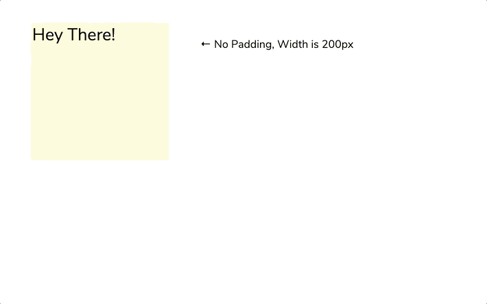
<div class="box">
  <span class="text">Hey There!</span>
</div>
Let’s also add some styles to the text we just added.
.text {
  color: white;
  font-size: 50px;
}
See the Pen border-box step 2 by Arpit Batra (@arpitbatra123) on CodePen.
Cool! That sure does look fine but the text is stuck on the corner. Let’s add some padding to the box.
.box {
  background: tomato;
  height: 200px;
  width: 200px;
  padding: 10px;
}
WHAT? The dimensions of the box have changed? What’s happening? After furiously digging in the browser’s dev tools, you find out the padding value of 10px is being added to the width and height of the box. The browser is doing this and is just ignoring the width and height you’ve specified.
So you have to calculate the actual width of all boxes in your brain now. You get anxiety by thinking of all the math you will have to do from now on. If you are somewhat like me, you are wanting to just quit and get back to browsing twitter or watching #productivity videos on youtube. You are also thinking of transitioning to learning back end development where at least the code you write will be respected and the language won’t do any magic on its own. (This is far from the truth, but you don’t know that yet)
All of your feelings are valid. At this point, you might start to not like CSS so much.
Whenever there is a divergence between your thinking model and the workings of a language, bugs, and frustration are bound to happen
Is there a way to make CSS respect the widths and height you specify?
Yes, there is. Let us add the box-sizing property with a value of border-box to the styles of the box element.
.box {
  background: tomato;
  height: 200px;
  width: 200px;
  padding: 10px;
  box-sizing: border-box;
}
See the Pen border-box step 3 by Arpit Batra (@arpitbatra123) on CodePen.
Lo and behold! The box has the padding, and also has the values for the widths and heights that you specified!
How did this work? Well, by default, all elements have the value content-box for box-sizing. This means any padding and margins you add are added to the width and height of elements. border-box prevents that behavior.
You want border-box to be the default value for all elements to eradicate the frustration you were dealing with a few minutes ago! This can be done easily by using universal selectors in CSS.
Here is how this css-tricks article recommends we do it at a global level:
html {
  box-sizing: border-box;
}
*,
*:before,
*:after {
  box-sizing: inherit;
}
Once this is done, you should not struggle with weird widths anymore. The browser will now obey you.
These are the articles that helped me out in understanding and imparting this box-sizing wisdom to you. Visit them for more information on box-sizing and some examples of how this property can be helpful in a world real use case.